Today's the kind of day I live for here in Vermont; sunny, warm, buds showing their tiny red and green faces. I even welcome all the creepy flying things.
It is such a surge of overall happiness that I always question why I live where winter scourges my very soul more time out of the year
than not. Granted there are a few wondrous days in January when the snow is still pristine white draped upon low hanging branches, but it gets old
when the black slush eventually takes back the snow banks. Nothing beats a springtime sun reaquainting itself with my face.
That is when I know, it is for that very reason I love it here. Each summer day is a treat, fleeting and temporary, taken back each October even more quickly than
returned in spring. For that it each day is truly appreciated.
Tuesday, April 30, 2013
Sunday, May 2, 2010
Final Project
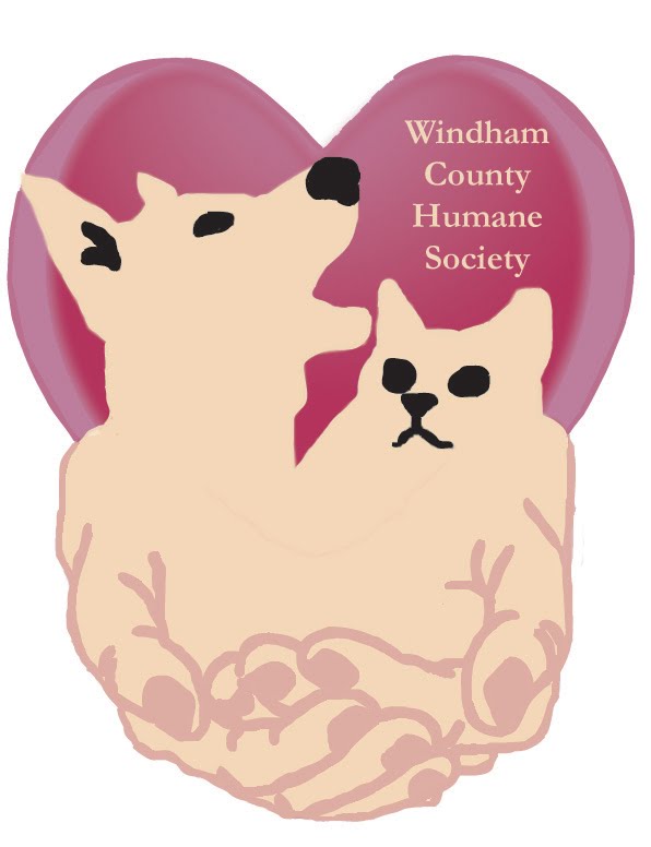
I chose the Windham County Humane Society as my organization to promote. Below is a new logo, business card and a trifold brochure.
Logo:

Business card:
Brochure setup:
Inside Back - inside middle back - Front

Other side of brochure set up:
Inside front - inside middle front - Back

Logo:
Business card:

Brochure setup:
Inside Back - inside middle back - Front

Other side of brochure set up:
Inside front - inside middle front - Back

Poster assignment
My organization of choice is the Windham County Humane Society and the poster to promote donations uses tertiary contrasts for the artwork of yellow-orange against blue-violet. For the text I used primary colors of blue, green and orange.


Sunday, April 25, 2010


Saturday, April 17, 2010
Self Portrait Assignment

Sunday, April 11, 2010
Week Il = Illusion of space and motion
In all of these examples the red outline is my addition in Photoshop to illustrate my point and is not part of the original artwork.
Illusion of Space
 Size:
Size:
This painting by Linh Chin-Lai
uses size to create the illusion of space. Flowers in the foreground are larger, flowers get smaller as they recede into the distance.
 Overlapping:
It wasn't clear who the artist is on this one, off of webshots website, loaded by prasantti, but this is an example of the use of overlapping to create space. The young girl in front of the dying girl in the lap of the mother, with a women behind her and yet another behind her give the illusion of depth and space.

One-point perspective:
This photograph from Retro-perspective Fine Art Prints utilizes the lines of the bridge and the railroad tracks to focus the eye to a single focal point, giving it a one-point perspective.
Illusion of Motion
 Repeated figures:
 The repeated figurines of rabbits by Pierre Vanni gives this sculpture a sense of motion as you expect more and more to show up. This sculpture also uses anticipation by the position of the running legs to allude to motion.
Figure cropped:
This painting called Ballroom Dancing by John LaGatta crops out the extension of the man's legs and the woman's arm to maintain imagined motion by suggestion.

Op art:
This optical illusion by Japanese artist A. Kitaoka uses only static lines to create a sense of motion.
Illusion of Space
 Size:
Size:This painting by Linh Chin-Lai
uses size to create the illusion of space. Flowers in the foreground are larger, flowers get smaller as they recede into the distance.
 Overlapping:
 It wasn't clear who the artist is on this one, off of webshots website, loaded by prasantti, but this is an example of the use of overlapping to create space. The young girl in front of the dying girl in the lap of the mother, with a women behind her and yet another behind her give the illusion of depth and space.

One-point perspective:
This photograph from Retro-perspective Fine Art Prints utilizes the lines of the bridge and the railroad tracks to focus the eye to a single focal point, giving it a one-point perspective.
Illusion of Motion
 Repeated figures:
 The repeated figurines of rabbits by Pierre Vanni gives this sculpture a sense of motion as you expect more and more to show up. This sculpture also uses anticipation by the position of the running legs to allude to motion.
Figure cropped:
This painting called Ballroom Dancing by John LaGatta

Op art:
This optical illusion by Japanese artist A. Kitaoka
Sunday, April 4, 2010
Texture and Pattern
I scanned the following 15 items as examples of texture:
a bamboo placemat
straight pins
cross cut cardboard from cat scratcher
terrycloth
hay
sand paper
oatmeal
pressboard
tin foil
Easter grass
a feather duster
crocheted lace
stones
string of beads
golf balls

I created a gray scale from parts of those scans, sometime having to enlarge to zoom into a certain value of that scan.

Subscribe to:
Posts (Atom)