Originally created for the purpose of the multimedia class I took through CCV. Now I will use it for my 2-Dimensional Design class.
Sunday, August 16, 2009
August 18, 2009
I didn't quite know what this class was going to be about when I enrolled in this class, and I certainly got a lot more out of it than I was expecting. I look forward to practicing and playing a little more with the a number of the sites I have learned about and now are a member of.
I have compiled my portfolio, moving my resume and previous accomplishments to the top while including the class projects under those because my goal is to present this to an employer. I feel that it is much neater and a more professional presentation than I had before, and that, I hope, will help me find a new direction to take my career.
Monday, August 10, 2009
August 10, 2009 - Reflections
August 10, 2009
Saturday, August 8, 2009
Aug. 8, 2009
Took a while to come up with an idea for this next project, but I'm kind of excited about this subject, since it is near and dear to my heart. It will also give me a chance to research the details and answer some of my own questions.
Form: (How: video)
Audience: (classmates, teacher and anyone else)
Topic: (How newspaper production has changed in the last 50 years)
Purpose: (educational)
Monday, August 3, 2009
Aug. 3, 2009 post reflections
Aug. 3, 2009 reflections
http://www.doink.com/clips/sweetcicely/464947
Aug. 3, 2009
Going to do the animation portion of my assignment now.
Form: (How: animation)
Audience: (classmates, teacher and anyone else)
Topic: (TDB)
Purpose: (humor)
I really can't come up with an idea yet until I browse through the art options available and then an idea (hopefully) will hit me. I chose DoInk because I liked the fact that at some point I can do my own drawing on this program. Here goes nothing!
Saturday, August 1, 2009
Aug. 1, 2009
First off my FATP
Form: (How: Cartoon.)
Audience: (classmates, teacher and anyone else)
Topic: (man, woman)
Purpose: (humor)
I chose toondoo because it had an option to doodle, which I ended up not using this time, but I may in the future.
I drew out a stick figure sketch to tell a story in five frames, however I couldn't quite get the tools to do what I wanted my characters to do so I refined my story to 3 frames. I actually like it better than my original plan.
This is my toon.
Monday, July 27, 2009
Reflections
It also took a little practice to use the microphone, discovered I had to talk directly into it. (I bought an external one). This was a huge file and it took well over an hour to load, so I need to figure out how to make it smaller next time. I have to admit it was a lot more fun than I expected.
July 27, 2009
Sunday, July 26, 2009
July 26, 2009
July 26, 2009 redo of July 24, 2009
For my podcast assignment I subscribed to Galavanting – Koldcast.tv. It initially grabbed my attention because the icon representing the podcast presented itself as an informative and fun way to view travel options that wasn’t a commercial promotion. I was right.
The one I chose to review was Guide to NYC: Galavanting-Koldcast.tv. The introduction is a simple but effective flash clip of their logo, then an interesting sort of 1960s style graphic that struck me as representing motion, transitioning on to an introduction of the girls on the assignment. This was reminiscent of the Charley’s Angels introduction of the 1970s, a silhouette of girls holding tech equipment rather than guns.
I enjoyed the photography even if it was a little grainy, because it really captured the essence of New York City with interesting perspective shots mixed in with a sense of fun that can be had in the city. The choice of music was great, used sparingly to punctuate a segment.
The podcast led the traveler through an itinerary featuring several businesses, interjected with great tidbits helpful to the traveler and humorous little episodes.
All in all, there was great style, great choice of music, smooth transition between segments and informational with a touch of humor.
Monday, July 20, 2009
July 20, 2009
The newspaper at which I work is too slowly incorporating some of the new technology with a web site and a new web site that is more interactive, and that has been way under utilized and promoted. We also have blogs and a twitter account only because our present editor has some web savvy, but the company needs to be much more aggressive in this. With recent events just staying alive is the narrow field of vision. In my particular office which is part of a parent company with three other newspapers there has been a lot of consolidation of different departments being handled out of one town's newspaper's office for the four papers, leaving most of the website stuff handled in another office. Newspapers still have a large older audience that don't want anything to do with computers and internet, but to gain the younger audience there needs to be a new approach added. There isn't enough advertising dollars out there right now to support both.
Saturday, July 18, 2009
Alternative Energy
http://www.slideshare.net/joannageary/the-death-of-newspapers-finding-business-models-in-a-perfect-storm
Monday, July 13, 2009
http://www.flickr.com/photos/40122497@N02/sets/72157621416584450/
The photo of Hogback is an example of framing, with the pine tree and building framing the view.
The road photo is an example of thirds with the subject road leading into the center.
The Strolling photo is an embedded photo of a circle with the exposed flesh of the two faces and the chest.
The fisherman photo is of saturated color. The original photo is taller with more of the sky exposed to balance more. Didn't realize flickr would crop it that way.
Fencing is shooting angles, unusual view.
I used GIMP for cropping these photos.
Sunday, July 12, 2009
July 14, 2009 update
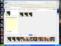
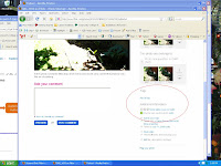
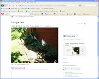

Update to my earlier post as I reread my assignment. I already had a flickr account so I added the three photos I posted earlier, placed them in a set under Photo manipulation in GIMP and edited them to be shared in Creative Commons with attribution. I used Greenshot to take a picture of the pages with the photos preferences set to be share with Creative Commons.
July 14, 2009


Creative Commons, a cooperative collection of art media of many forms is a way to share your art while maintaining some control over its use, depending upon the FREE license you choose. I love this. As this site grows and expands it will become as indispensable a tool as google or dictionary.com
For my open source photo manipulation I chose Gimp because it was the one program I hadn't yet played with and was wondering about it. It has a lot of similar features to Photoshop, such as the stamp to add more of scene to a photo such as more grass where there is mud, blue sky instead of a cloud.
In the middlle is my photo of an up and coming hosta garden in my front yard. In the bottom photo I chose the filter to convert it to look like an oil painting. How cool is that?
In the top photo I used the stamp that I referred to before in an attempt to stamp in some green to obliterate the over exposed sunshine in the photo.
I couldn't find find any options to change contrast or brightness or anything similar, so I guess I'll stick with Photoshop, but this is a great option for businesses on a tight budget that need a photo editing program.
Sunday, July 5, 2009
July 5, 2009
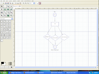
My assignment was to for the program dia - a free, downloaded program for the purpose of creating diagrams. I was rather impressed with its capabilities because it had a lot of flexibility with changing sizes, shapes and positions to tweak your graphics to look just as you would like them to. There were a lot of preloaded shapes to use, plus tools to create your own. I liked that there were many editing options, and it was pretty clear what was what.
I didn't find any freestyle drawing options though, so there were some limitations there.I also had a little problem getting the text to assign the right size to the text I was working with, perhaps with practice.
I could see this program useful to draw out a demonstration for instance:
http://www.screentoaster.com/watch/stVU9US0BIR11ZSF9VX19ZUVdR/dia_tutorial
I created this screen cast to show how the program functions. I had to use subtitles because it appears as though my microphone does not function.
Saturday, July 4, 2009
July 4, 2009
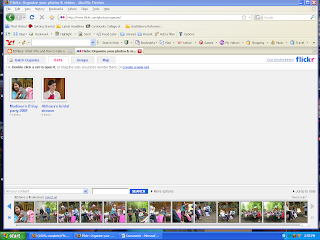
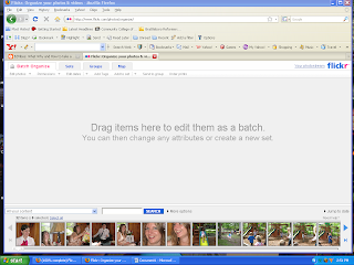
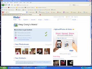
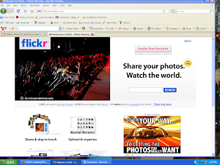
Flickr is free webware used to upload photos to a website as an easy way to share your photos. It has tools to help organize the photos by placing them in sets or batches, and an editing tool to rename the photos as another way to help organize them. With a good naming system it would be quite easy to search for a particular photo. There is a group option, and by joining one, one can view photos by people that share the same interests. There is map where one can pin photos to a location on the map, and I could see it used by a traveler to keep family and friends posted about their adventures, a modern day post card so to speak.
The only draw back here is a 100 mg limit, and with many photos taking 1 to 2 mg, that limit would be reached quickly. I found uploading images a little slow, but I could do it in the background as I opened another browser window to work from. I also found links to order prints for a price which is apparently how flickr can offer this as a free service.
Learned a lesson here when posting images - post the first image you want to be seen last! These here are backwards in order, but here we go - The bottom image is a screen shot of the flikr site where one initially goes to open an account. The next screen shot shows my personal site where I have already uploaded some of my photos, the third screen shot shows the options that are listed in the top menu for organizing your photos, and the last (top) screen shot shows how sets appear after being sorted into batches. Pretty cool. http://www.flickr.com/
Monday, June 29, 2009
June 29, 2009
and I am quite excited about the potential for really getting my information formatted in a neat and orderly way for prospective employers. I'm also mulling over ideas for what other uses google sites could be used for, family site, hobby site, the possibilities are endless.
Saturday, June 27, 2009
June 27, 2009
I have started my eportfolio at
http://sites.google.com/site/cicelyeastmansportfolio/Home
and not sure if I can create the site as I had imagined with my xmind map because of the constraints of the predetermined set up available. Still fiddling with how to edit it the way I would like. Onward.
Monday, June 22, 2009
June 22, 2009
Saturday, June 20, 2009
June 20, 2009
http://share.xmind.net/sweetcicely/stuff-about-me-2/
The goals for my web site are as follows:
Form: A web site with slideshow
Audience: Teachers or prospective employers
Topic: Content will be accomplishments
Purpose: To sell myself
Sunday, June 14, 2009
June 14, 2009
Friday, June 12, 2009
June 12, 2009
Sunday, June 7, 2009
June 7, 2009
Friday, June 5, 2009
June 5, 2009
Now the next hurdle. What the heck to write!
I couldn't resist testing the video upload. I recently learned how to create a little movie with my digital camera, and had gotten a little clip of my goldfish a while back just playing with that option, so here it is. For those that are concerned about the size of the tank, I moved them into a 10 gallon tank shortly after this was taken.